Color is information. Not meaning, not depth. Information.
The red awning, the yellow cab, the green shirt on the man looking the wrong way. Your brain processes it automatically, catalogues it, and moves on.
You think you have seen the photograph. You have barely read its surface.
Take the color away, and something strange happens. The image stops explaining itself.
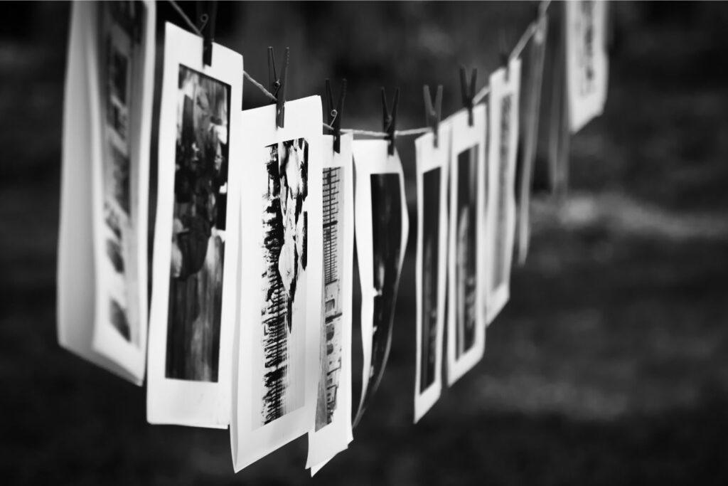
I noticed this early, almost by accident. I was going through old contact sheets, the kind nobody looks at anymore, and there was a frame I had dismissed in color that stopped me in black and white.
Same moment, same geometry, same light. But in monochrome, the man’s expression carried the whole weight of the scene. In color, his orange jacket had been carrying it instead. I had been looking at the wrong thing, and the photograph had been politely letting me.
This is what black and white actually does. It does not add drama, it is not a style choice, it is not nostalgia dressed as aesthetics.
It subtracts the first answer. It removes the shortcut the eye takes when it has enough color information to feel it has understood. What remains is structure.
There is a Heidegger phrase that keeps coming back to me, not because I am trying to sound serious, but because it is precise: the ready-to-hand becomes present-at-hand when it breaks.
The hammer you stop noticing until it stops working. Color is the hammer. It is so functional, so immediate, that it operates below attention.
Monochrome is the hammer after it breaks. You are no longer using the image. You are looking at it.
And looking, actual looking, is rarer than people admit. You spend most of your day perceiving.
Identifying, categorizing, filing. The coffee cup, the notification, the face of someone you already know. There is almost no room in this for seeing, which is different, which requires a kind of deliberate slowness.
The photograph in black and white asks for that slowness. It does not reward the first glance.
What you get instead is a play between fact and perception. A shadow that suggests a wall that may not exist.
A face half-lit that could be any age.
A texture on wet pavement that reads like fabric or skin or stone depending on the hour you encountered it. The image is not lying. It is simply not simplifying on your behalf.
This is why I think the question “what is the point” is the right question, and also slightly the wrong one. It assumes there should be a function, a purpose, a deliverable.
But the photograph in black and white functions more like a drawing, and nobody asks what is the point of a drawing when what they mean is: why did you not use a photograph instead.
The drawing does not capture more accurately.
It captures more selectively. And in that selection, it says something about how the person who made it was paying attention.
The frame is a choice.
Every edge, every exclusion, is a decision about what the story actually is.
Color keeps reopening that question, because the eye keeps finding new exits. Monochrome closes the exits.
Not to trap the viewer, but to make sure that when you do leave, you leave through the door the photographer found.
I am not suggesting you shoot in black and white. I am noticing that you already filter your attention in some direction, all the time, and that the results of that filter are what you call your experience of the world.
The question is not whether you are selecting, the question is whether you know what you are removing, and whether what remains is the thing you actually wanted to say.
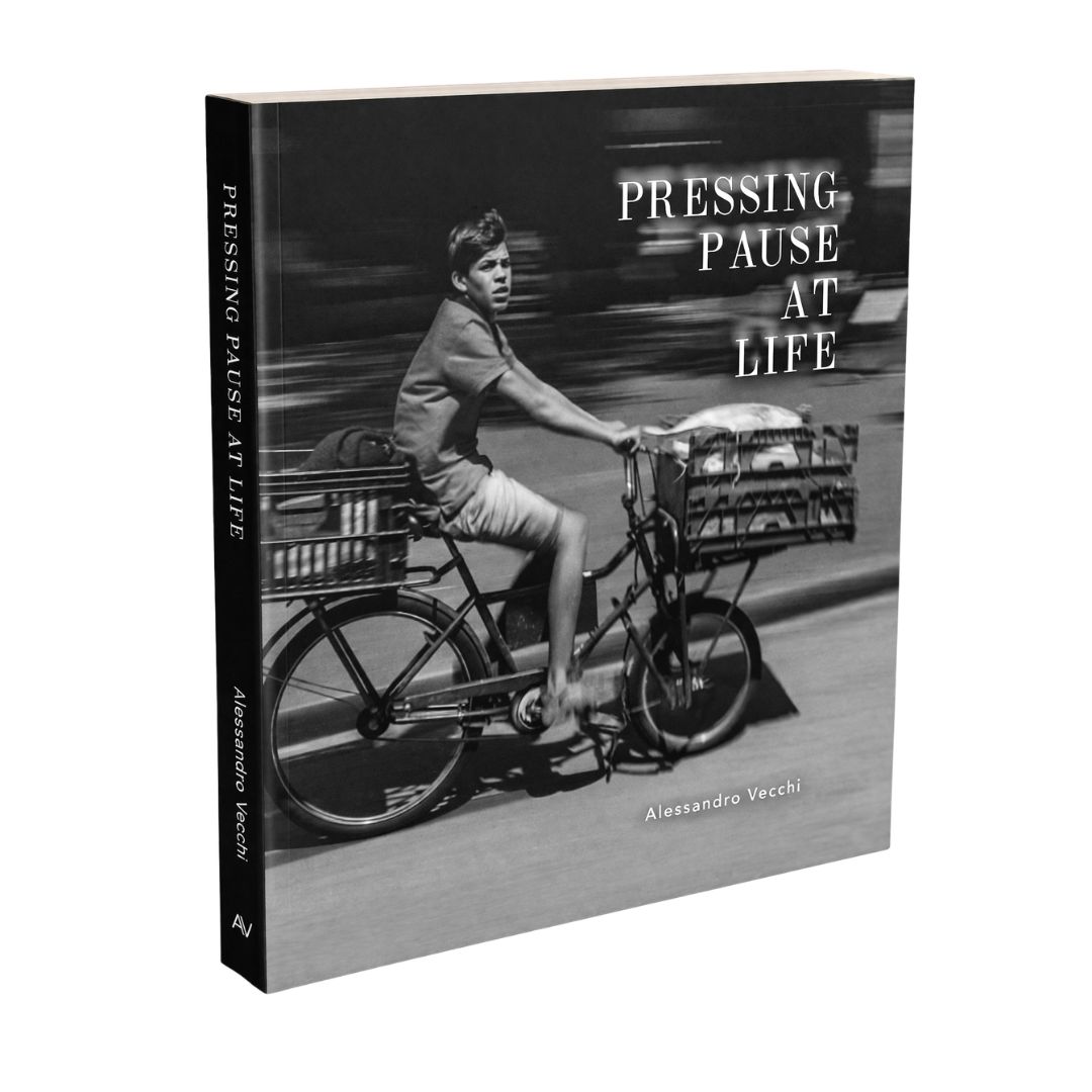
Pressing Pause at Life
240 pages of street photography paired with philosophical reflection. An invitation to notice what you've trained yourself to ignore: light on walls, silence between strangers, the weight of ordinary moments. The city was always saying something. This book teaches you to listen.